It’s time to face the facts.
It doesn’t matter how low your prices are; it doesn’t matter how big your range of products are; if your website looks outdated, customers are going to assume your brand is untrustworthy.
A modern, successful ecommerce store should be up-to-date with current design and customer experience trends, from serif fonts and asymmetrical designs to personalised shopping experiences and live customer service.
So with this in mind… is it time to update your ecommerce website design?
If you reckon your ecommerce website needs a refresh, you might want to keep reading. In this blog, we share six essential elements you need for a modern ecommerce website design, so you give your customers the shopping experience of a lifetime.
Let’s get stuck into it.
#1. Shipping calculator
In a recent report from ecommerce experts Forrester, it was found that 44% of online shoppers who abandon their cart do so because of unexpected (or unwanted) shipping and handling costs.
Image: giphy
Unexpected shipping costs are a major turnoff in the customer journey and checkout process. Imagine thinking you’re getting free shipping, right up until the point where you’ve added your postcode – only to get slapped with an extra $18 for shipping?
For a $10 tee-shirt, I don’t think so!
What this means for your web design
If you’re redesigning your website, you need to make your intentions clear from the moment your customer lands on the page.
Whether you’re offering free shipping or not, clue your customers on shipping from the get-go – add shipping costs and selling points above the fold (i.e. before the customer has to scroll to find more information).
![]()
Image: The Iconic
Alternatively, consider adding a shipping calculator to the product pages. This allows customers to add in their address and get an accurate shipping estimate, so they know what they’re paying for.
No unpleasant surprises. No unexpected costs. No cart abandonment.
At Transdirect, we offer shipping calculator integration for eBay stores, plus a range of other plugins for ecommerce stores. Ensure your customers get all the info they need to make their final purchase decisions!
#2. Mobile usability & thumb navigation
It’s no secret – customers are shopping via mobile more than ever before.
In 2018, 58% of all website visits came from mobile. People now have better access to smartphones than desktop computers or laptops and internet usage is on the rise across the globe.
Google (i.e. the big dog; the man; the alpha and omega) is also now indexing the mobile version of websites first – which means the friendlier your website is on mobile, the faster your website can be crawled and analysed, and the sooner you can start appearing towards the top of search results.
There’s no avoiding or curtailing it – mobile-friendliness is a must-have for your ecommerce website if you want to make sales and increase your visibility in search results.
What this means for your web design
Traditionally, menus and navigation buttons are located towards the top of the page, usually in the top left or right corner. However, 94% of smartphone users hold their devices vertically, which means customers on smartphones need to put in extra effort to access the menu.
To combat this, web designers have started adding navigation buttons towards the bottom of the screen to facilitate thumb use.
The reason?
The less customers have to think about how to get to where they want to go, the more they can focus on shopping. It sounds simple but ensuring the website is “thumb-friendly” creates extra convenience for the customer.
Small conveniences = more sales!
#3. Live chat
Speaking of convenience…
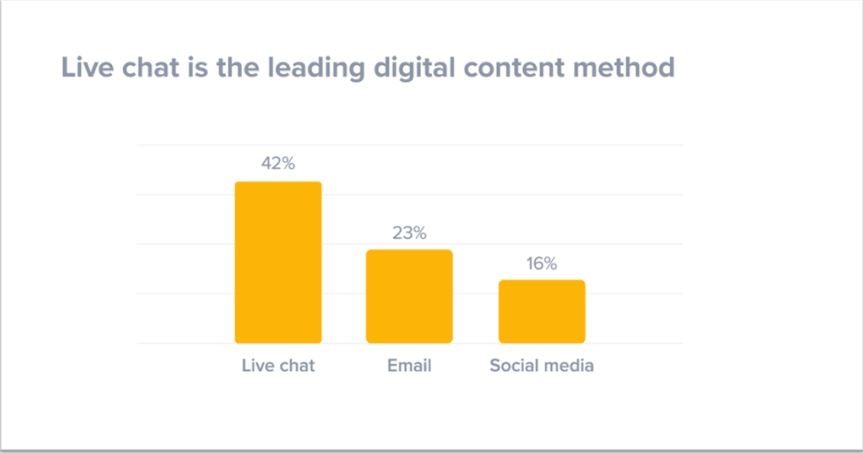
Live chat is an invaluable customer service tool you should be taking advantage of. In 2019, live chat has become the leading digital contact method for online shoppers and 42% of customers prefer live chat to email, social media or forums.

Image: Super Office
Plus, 51% of customers want businesses to be available 24/7.
The internet never sleeps – and neither should customer service.
What this means for your web design
Live chat often appears as a little question mark or pop-up box in the bottom corner of the page. Here, customers can ask questions about products, shipping, sizing and more – then get answers within a matter of seconds from you and/or your customer service team.
Installing live chat can be as simple as adding a piece of code (Javascript) or integrating live chat through platforms like Magento, Shopify, and Woocommerce. Most ecommerce platforms now have live chat integration software pre-installed, so all you have to do is enable it!
#4. Personalisation & recently viewed
Unlike customer service teams in traditional brick-and-mortar stores, online business owners have the unique chance to get to know customers intimately after a single visit – and it’s all thanks to cookies.
Cookies are small pieces of website data which are stored on a customer’s computer and collected via web browsers like Google and Bing. Cookies allow you to collect a vast amount of information about your customers which you can then use to remember your customer’s preferences, pages they browsed and even products they looked at (with or without buying them).
Sounds creepy… why do I need cookies?
According to a recent report from ecommerce specialists Accenture, 91% of customers are more likely to shop with businesses who remember them and provide relevant offers. Plus, 83% of customers are willing to share their data in exchange for a personalised experience.
Personalisation makes customers feel special, so needless to say – personalising customer experience is essential in modern shopping scenarios, regardless of the creep factor involved.
What this means for your web design
Using cookies, you can personalise your customer’s shopping experience to target their specific interests, preferences and habits.
For example, we visited Australia’s version of the Iconic to look at men’s jeans. After clicking on some blue slim fit from Levi’s, we were presented with a slider of products under “you may also like…”
![]()
Image: The Iconic
Similarly, after looking at a Ralph Lauren polo jumper, we were presented with “wear it with…” and extra products which complement the jumper.
![]()
Image: The Iconic
Most ecommerce platforms have apps for product personalisation – for example, Shopify has their Product Personalizer app which can easily be added to your website and Woocommerce has a library of product personalisation apps to choose from.
#5. Bestsellers & restocked sliders
When it comes to online shopping, you have about three seconds to make a decent impression and catch your customer’s attention – so you need to make your homepage your best friend and most important asset.
So how do you convince someone to stay within three seconds?
You need to optimise for conversions with bestseller and “restocked items” sliders on the homepage. There’s a reason these items are selling out and bringing home the most bacon – there’s a good chance these are the items your customers have been searching for!
The Grooming Lounge, for example, is one of America’s top online shops for men’s shaving and grooming products.
One of the first things you see when you enter the website is their “top picks for summer”, complete with icons showing their award winners and products sponsored or designed by celebrities like Jack Black.
![]()
Image: The Grooming Lounge
These are most likely The Grooming Lounge’s most popular products, so they’re using their strengths to capture the attention of their customers from the moment they land on the page.
What this means for your web design
Use analytical tools like Google Analytics, you can determine which products and categories are your best performers, then optimise your homepage and product personalisation to match.
Aim to promote these products in banners, carousel sliders and “recommended products” areas throughout your website, but most importantly on the homepage to make a big first impression.
Again, most ecommerce platforms like Woocommerce, Neto, and Shopify have apps you can add onto your existing setup to achieve this – plus, they’re customisable,so you can determine which popular products you’d like to spruik on the homepage.
#6. Social media integration & social proof
Social media is the modern equivalent of a goldmine – why?
Because 79% of customers trust another customer’s review as much as a personal referral and in 2019, most people take to social media to share their thoughts, triumphs and complaints about a product or business. True story.
Social proof (celebrity reviews, endorsements, customer reviews, testimonials, complaints) is a psychological theory which describes our natural tendency to rely on the opinions or actions of others to inform our own.
Social proof validates our choices when it comes to online shopping because other people’s opinions and reviews dictate whether a product is worth your time, money or interest.
Essentially, we’re all sheep… follow the herd!
Image: giphy
What this means for your web design
If your customers like to share reviews, photos and videos of your products on social media, you’re definitely going to want to add social media integration to your website – this might be the determining factor for a new customer to check out with you!
Displaying customer reviews, photos and videos does three very valuable things for your brand:
- Creates social proof
- Makes the products easier to visualise
- Puts a human face to your brand.
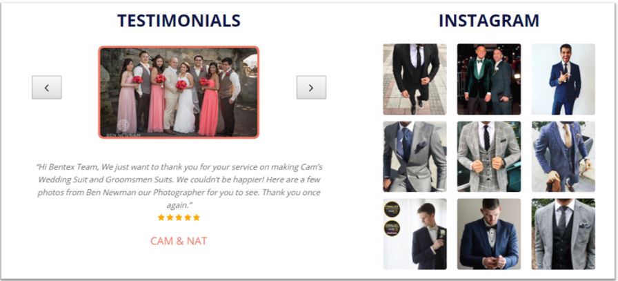
Take Bentex Suits, for example – they have integrated Instagram into their website to show-off customers in their custom, tailored suits made right here in Australia. They have also taken advantage of their collection of testimonials and added an interactive slider of images and personal reviews.

Image: Bentex Suits
Bags To Go, on the other hand, sell a range of travel bags like suitcases and carry-on bags. Without a strong social media presence, Bags To Go bypassed social media integration and harnessed the power of TrustPilot, a consumer driven review platform which can easily be integrated with your website to display positive reviews.

Image: Bags to Go
Social proof can be a powerful trigger for new customers to make the decision to check out. Whether you’re planning a brand new ecommerce website or refreshing your current design, adding customer reviews, testimonials and social media posts is essential!
Convince your customers to check out with a contemporary, trustworthy website design
According to research from America’s Stanford University, 46.1% of customers consider a website’s design the top criteria for deciding whether a company is credible or not.
If you’re gunning to see your conversion rate improve and start raking in some serious dough, you’re going to need a professional website design to help you get there. You can achieve great things with a few simple additions:
- Live chat for instant customer service;
- A shipping calculator to eliminate unexpected costs and enable self-serve customer service;
- Mobile usability and strategic menu placement for ease of thumb-based scrolling;
- Personalised shopping experiences using cookies and additional plugins;
- “Best sellers” and “restocked” sliders to encourage customers to find their target product faster;
- Social proof plugins to show-off your customer reviews, testimonials and social media posts.
At Transdirect, we’re committed to improving your customer’s experience through streamlined shipping – so we’ve created a range of shipping plugins to make your job easier and make shopping simpler for your customers.
Improve your ecommerce website design with a brand new shipping calculator from the team at Transdirect!
